

Why I built it
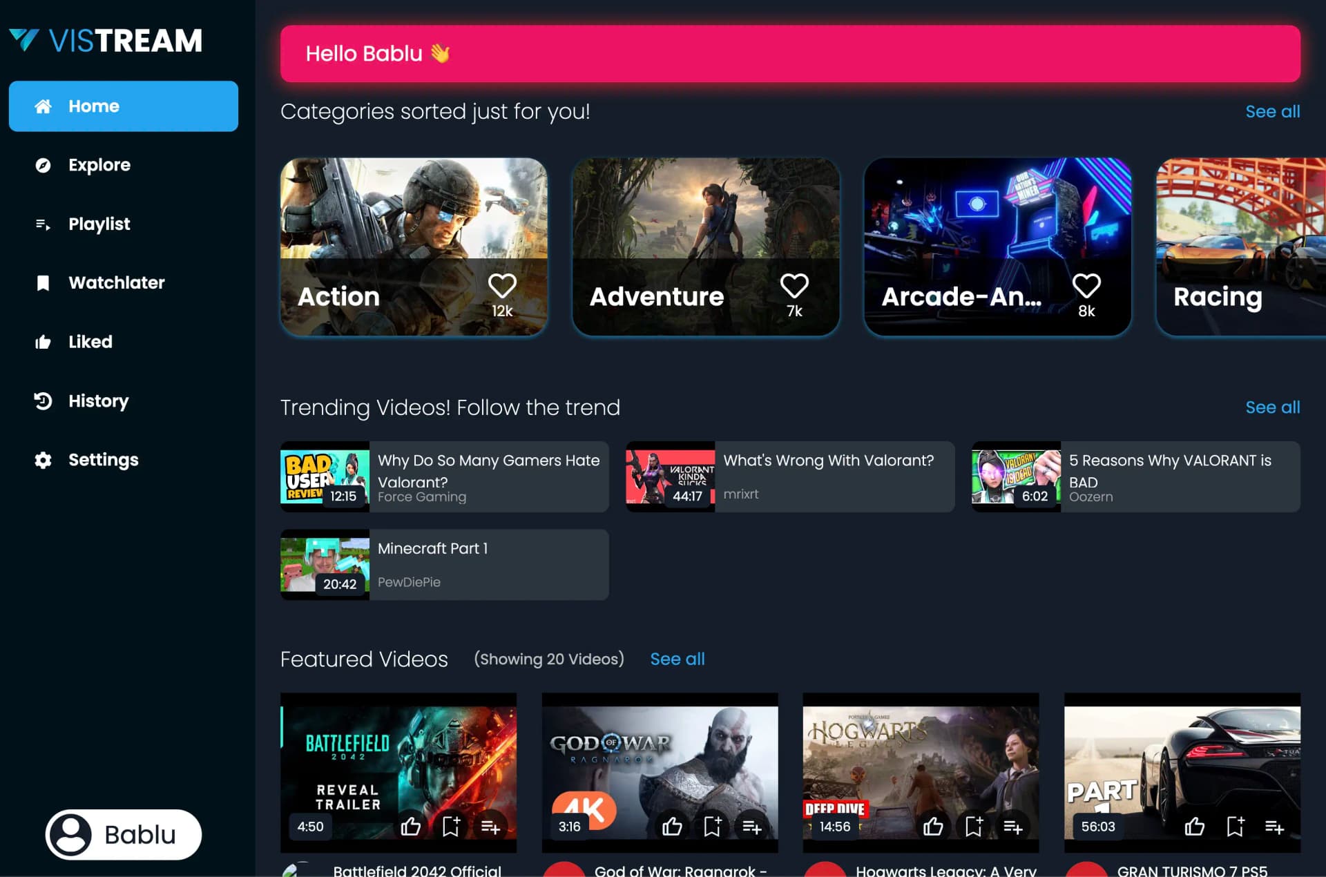
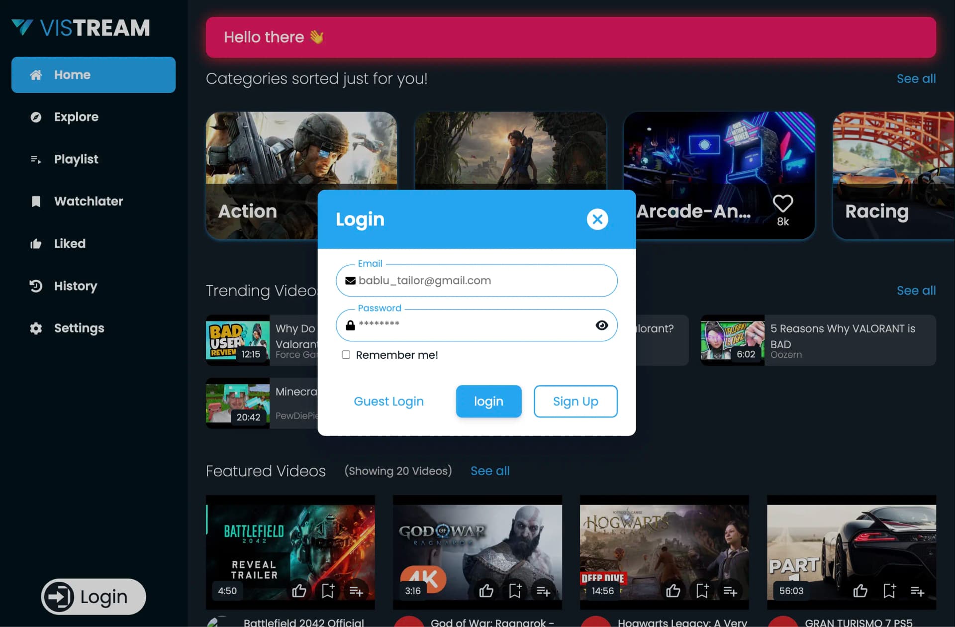
Streaming UIs live or die on feel. The catalogue can be fine and the player can work, and people still leave if navigation feels random or every click waits a beat before anything moves. Vistream is a React front end I built to practice that part: composing components, laying out a dense screen, and keeping the gap between a click and a visible change small.
This is a product-facing engineering exercise, not a media-infrastructure one. The problems I spent time on were structural. How views compose. Where state lives. How loading and error states read inside a grid of tiles.
Sole builder, spec-driven
Feature ideation, architecture, implementation, and bug triage were all mine. No
teammates, no reviewers, no assigned tickets. I worked against my own written
specs, with an append-only session knowledge base in claude/context.md and a
teaching journal in claude/learnings.md.
Architecture
Shell
Owns the page and the navigation frame. Predictable navigation was the first design priority.
Composition (JavaScript, ~81.5% of the code)
Each view composed from shared components rather than built bespoke, so velocity held as features grew.
Extraction happened at genuine reuse. Splitting on theoretical reuse only adds prop plumbing.
Where interaction delay is won or lost - the gap between a click and something visibly changing.
Presentation
A fifth of the codebase by design. In a content interface the layout system carries real product weight.
The eye needs to know where to land in a screen full of tiles. Hierarchy does that work, not decoration.
- Shell
- Composition
- Presentation
No service split - this is a front end. Four layers, with the styling system treated as a first-class one. Hover for the reasoning.
An app shell, feature views built from shared components, a state and event layer driving the dynamic bits, and a CSS system that keeps the look consistent. Four layers. No service split. This is a front end, and pretending otherwise would only add ceremony.
- React
- React Router
- Context API
- JavaScript
- Video
The tech stack, and why
| Layer | Choice | Why it earned its place |
|---|---|---|
| Framework | React | Component composition is the actual subject; React makes composition the default unit of work |
| Core language | JavaScript, ~81.5% | App and component logic, with no type-layer overhead between an idea and a rendered view |
| Styling | CSS, ~17.8% | A real share of the codebase, because layout and visual system are the deliverable in a streaming UI |
| Misc | ~0.7% | Config and metadata |
That ratio is worth a look. Nearly a fifth of the code being CSS is not sloppiness. In a content consumption interface, the layout system carries as much product weight as the logic does.
Streaming UX responsiveness
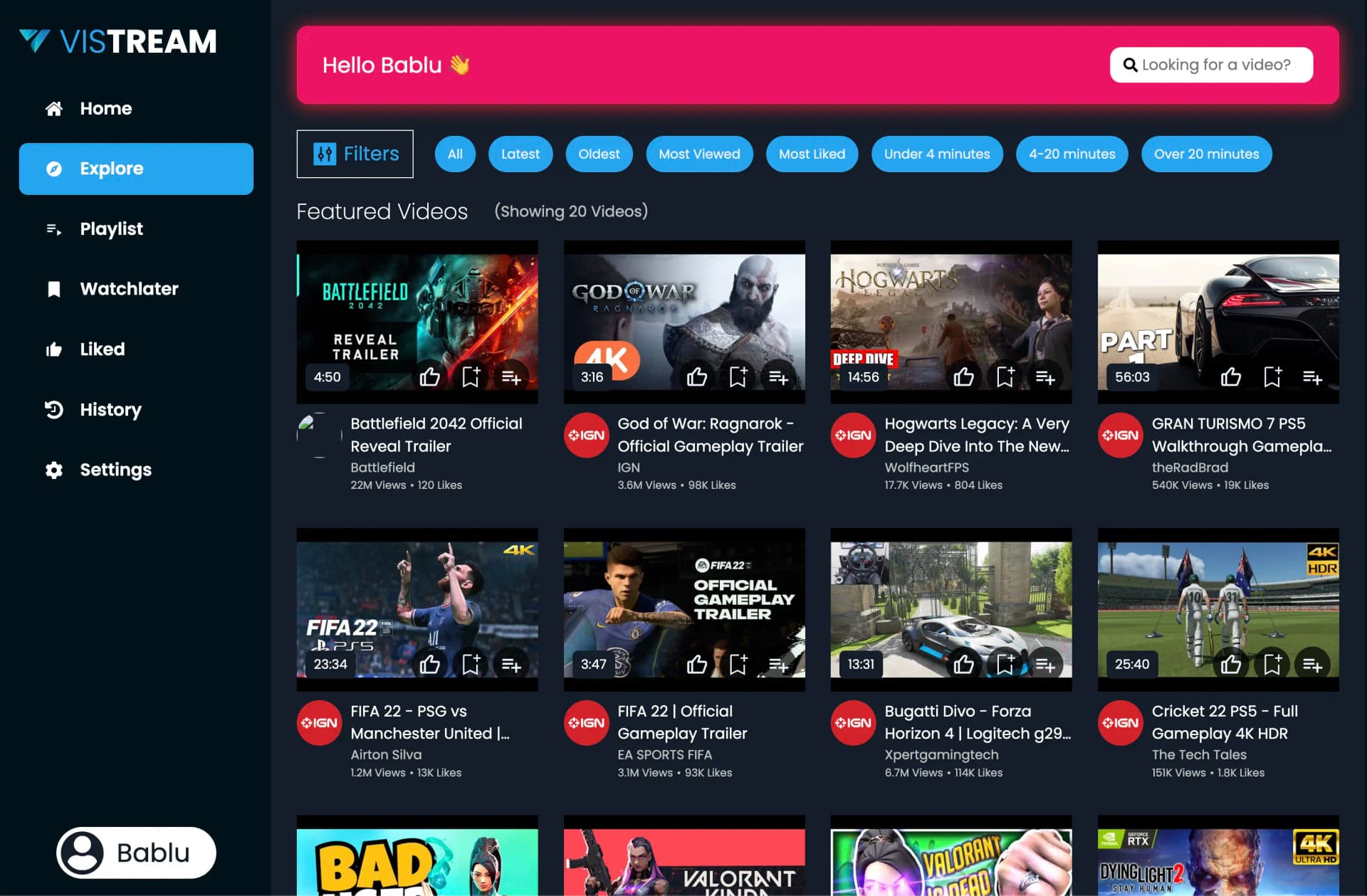
Content-heavy interfaces punish friction. I wanted low-friction interaction: smooth transitions between views, a clear hierarchy so the eye knows where to land, and no click that leaves you wondering whether it registered.
The tradeoff is blunt. A richer UI costs more render work. Every transition, hover state, and breakpoint is more work per frame and more state to get wrong. I leaned on predictability over flourish. A navigation model the user can guess correctly beats an animated one they have to learn.
Component modularity
Predictability first: an interaction the user can guess correctly beats one they have to learn.
Kept close to the view that owns it, so a visual bug has one obvious place to look.
Standardised component shapes mean a regression looks different from its neighbours.
Richer UI costs render complexity. The budget went to smoothness, not to flourish.
Each hop is a place perceptible delay can creep in, and each is bounded by a convention rather than by an optimisation.
I pulled reusable view logic into clean components so feature velocity would not fall apart as the surface grew. Standardizing component patterns and styling conventions is what kept UI behaviour stable across features. Without that, content-heavy interfaces break the way you'd expect: one inconsistent component at a time.
Granularity has a floor
Excessive granularity creates its own overhead. Splitting a component because it could be split means more files, more prop plumbing, and more indirection between a visual bug and the code causing it. I stopped splitting at genuine reuse, not at theoretical reuse.
Design rationale
Which frontend decisions mattered most for a streaming-style interface? Three, in order: predictable navigation, responsive visual hierarchy, and keeping perceptible interaction delay low. All three point at the same goal, reducing the cognitive load of consuming content, while keeping the structure loose enough that adding a feature does not mean relearning the layout.
Why treat this as a UI project rather than a media project? Because the failure mode I wanted to study is a UI failure mode. People abandon content interfaces over structure and responsiveness far more often than over playback. Scoping to the interface meant every hour went into the part with the most to teach.
Why standardize component patterns so early? On a solo project, consistency is the only substitute for code review. If every component follows the same shape, a regression stands out because it looks different from its neighbours. Cheap defence, and the reason UI behaviour stayed stable while features were still landing.
Where it stands
An earlier project, described honestly
Vistream is live and open source, tracked on the development branch. It is a
prototype and reads like one. The component patterns and the layout system are
the parts I'd stand behind. The value I took from it was learning how much of
"smooth" is structural discipline rather than clever animation.