



Why I built it
Developers abandon UI libraries when the docs are unclear or hard to navigate. A component that works is still unusable if nobody can find the class name. A library with confusing docs feels broken even when it isn't.
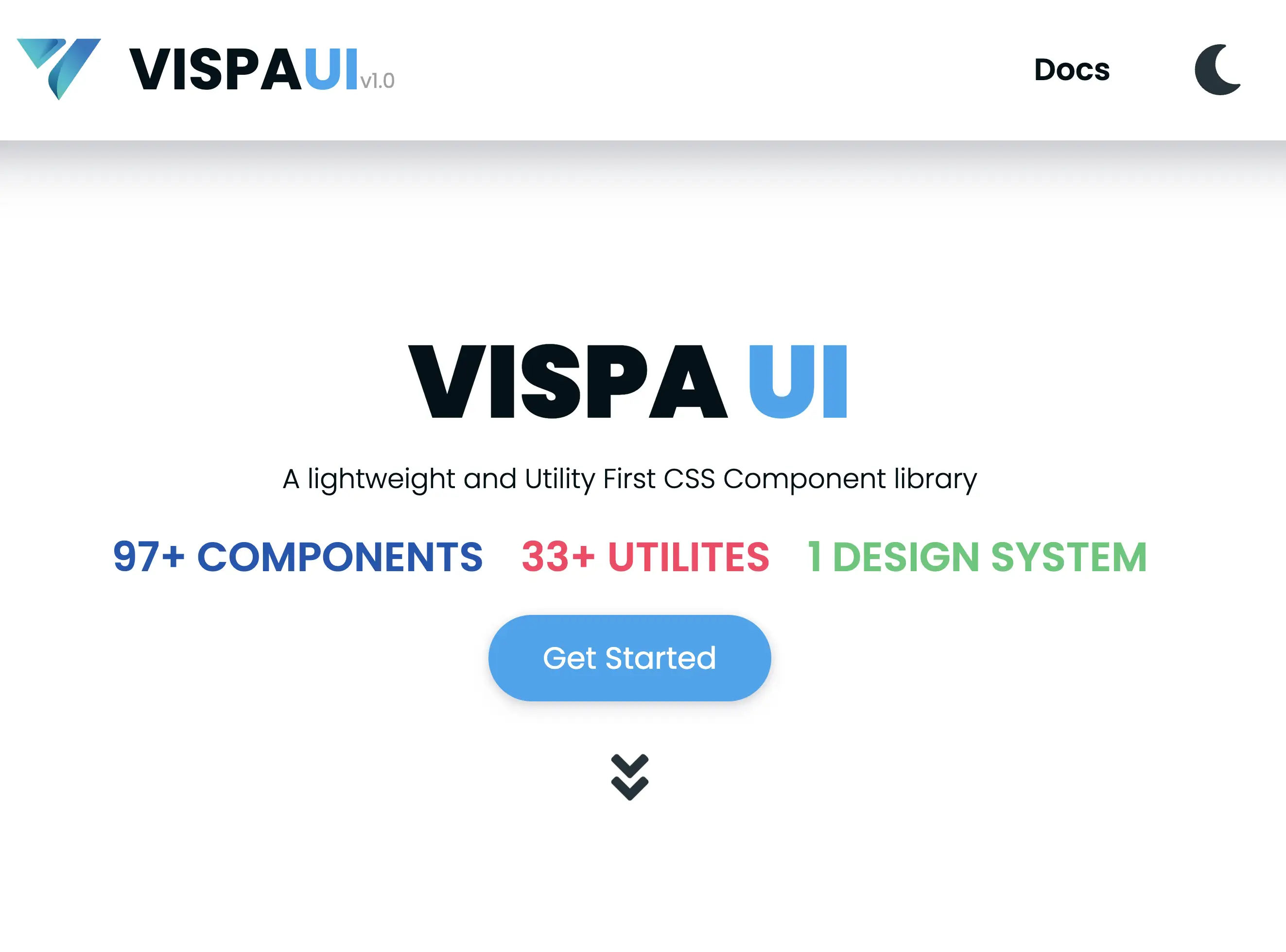
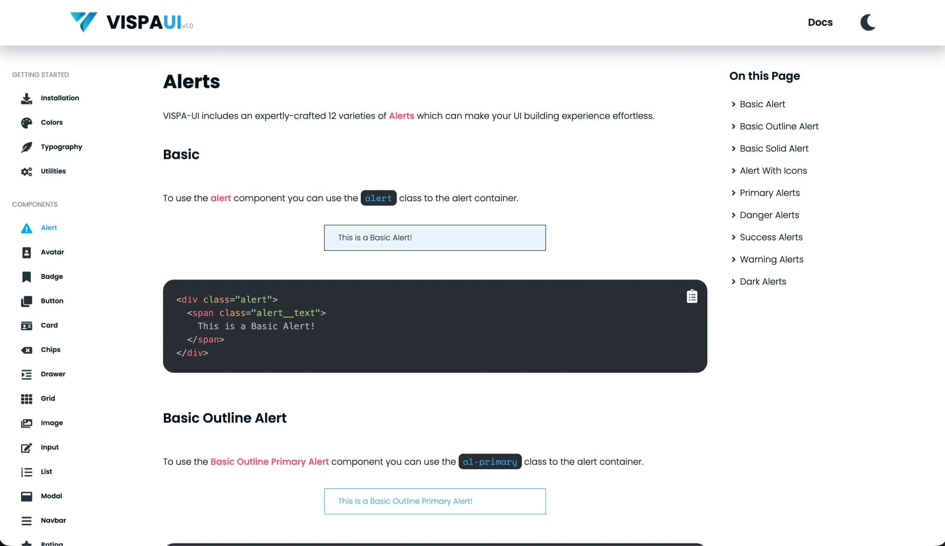
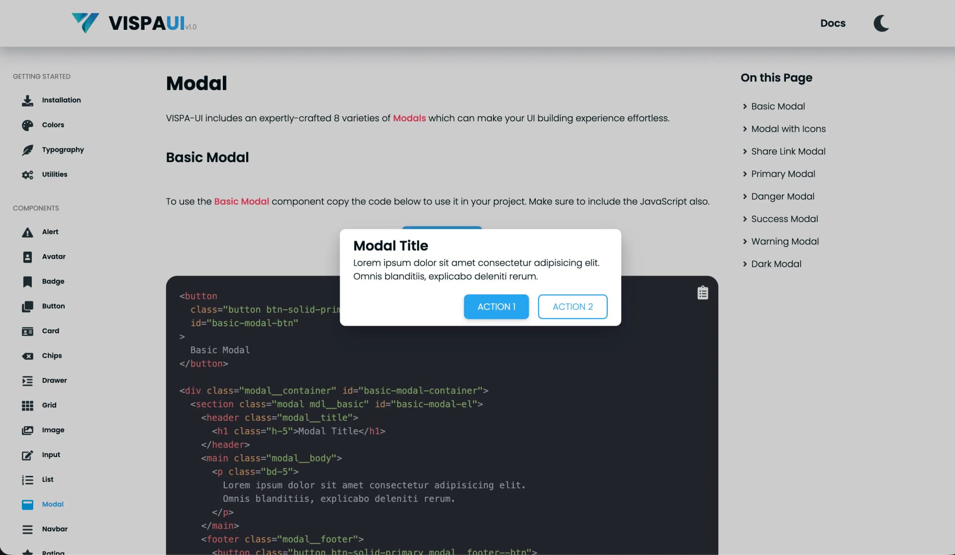
VISPA UI Docs is the documentation experience for my utility-first CSS component library. The premise was simple: docs are the primary interface to the library, not an afterthought. Success meant time-to-first-working-snippet, so the site is organised around clear examples, readable structure, and a fast copy-and-use path.
Great component libraries fail without great docs.
Sole builder, spec-driven
Information architecture, documentation conventions, and implementation were all
mine. No teammates, no reviewers, no assigned tickets. I worked against my own
written specs, with an append-only session knowledge base in claude/context.md
and a teaching journal in claude/learnings.md.
What the site is made of
Structure (HTML, ~97.1% of the code)
Nothing stands between a content edit and a published page. Static delivery is why docs performance holds up.
Every component page follows the same template, so learning one page teaches you all of them.
Practical snippets first. The reader gets something working, then finds out why it worked.
Presentation (CSS, ~2.1%)
Utility-first classes styling the docs that explain utility-first classes.
Behaviour (JavaScript, ~0.8%)
Discoverability aids and copy-and-use affordances. A docs page must be readable before any script runs.
- Content structure
- Styling
- Interaction
A taxonomy rather than a request flow - it is a static site, so what matters is what the pieces are and which stays thin. Hover for the reasoning.
Four kinds of thing. Keeping them distinct is what makes the docs maintainable. A static structure holds everything. Component reference sections carry the per-component content. Example and demo blocks do the actual teaching. A thin layer of navigation and helper interactions makes it all reachable.
- HTML
- CSS
- JavaScript
- VISPA-UI
- Git
The tech stack, and why
| Layer | Choice | Why it earned its place |
|---|---|---|
| Documentation markup | HTML, ~97.1% | Content is the product here; a static HTML site has no build step between writing a doc and shipping it |
| Styling | CSS, ~2.1% | The layout and visual system, and a live advertisement for the library's own approach |
| Interactive behaviour | JavaScript, ~0.8% | Minor dynamic enhancements only, so a docs page never waits on a bundle to become readable |
Ninety-seven percent HTML is a decision, not a limitation. Static delivery is why documentation performance stays strong. There is no framework standing between a content edit and a published page.
Utility-first CSS, and the readability cost
The library is utility-first: small, composable classes that build a design quickly, instead of a wardrobe of pre-named component styles. It's a fast way to work, and it's the foundation the whole library sits on.
The tradeoff the docs have to solve
Class-heavy markup hurts readability without conventions. A utility-first snippet can carry a dozen classes on one element, and a newcomer reading it sees noise rather than intent. That is a documentation problem, not a CSS problem. Part of why the docs needed to be a real project.
Information architecture
Read first
Developers arrive with a specific thing to build. The snippet answers that before anything else.
Read second
Kept on the same page, not a separate one - it is what stops example-first from hiding the concepts.
A utility-first element can carry a dozen classes. Conventions are what turn that from noise into intent.
Holds it together
Pays off on every read, costs on every write. Skipping a section is how a navigable docs site erodes.
Read top to bottom, this is the example-first order: working snippet, then the utility classes behind it, then the surrounding conventions.
How content is structured decides whether it can be discovered, and docs UX decides adoption speed. The structure is intentionally repetitive. Every component section follows the same shape, so once a developer learns one page they can navigate the rest without relearning the layout.
Clarity over cleverness
When a clear explanation and an elegant one conflict, clear wins. Docs are read under time pressure by someone trying to finish something else.
Example-first learning
Practical snippets come before deep theory, so the reader can get something working and then understand why it worked.
Consistent patterns
Repeated content templates across sections. Predictable structure is what makes a docs site skimmable.
Fast, lightweight delivery
Static HTML with minimal JavaScript. Documentation that loads slowly is documentation people stop consulting.
Strict structure needs discipline
A rigid content template pays off on every read and costs on every write. The person adding a component has to fill in each section even when one feels redundant, or the consistency that makes the site navigable quietly erodes.
Design rationale
Why treat documentation as a product? Because documentation directly decides developer success and adoption. If the docs are confusing, even good components feel unusable. The reader's experience of the library is their experience of the docs. So I designed VISPA UI Docs as a primary user experience with its own information architecture and conventions, rather than as a README that grew.
Why example-first rather than concept-first? Because it matches how developers actually arrive: with a specific thing they're trying to build. Leading with a working snippet gets them productive in one read. The explanation lands better afterwards, when they have something concrete to attach it to. The risk is real. Example-first can hide conceptual depth if the explanation never follows, which is why the utility-class reasoning sits directly beneath the snippet instead of on a separate page.
Why static HTML instead of a docs framework? A docs framework buys authoring conveniences I didn't need and costs a build step, a dependency tree, and a JavaScript payload on a page whose entire job is to be readable immediately. At 97% HTML the site has nothing between an edit and a published page.
Where it stands
An earlier project, described honestly
The site is live and open source, tracked on the development branch. What I'd
point at is the information architecture and the content conventions, the parts
that make the docs maintainable as the library changes. The lesson I took from it
is that documentation quality is a design problem with its own tradeoffs, and
treating it as writing-up-afterwards is how libraries go unused.