

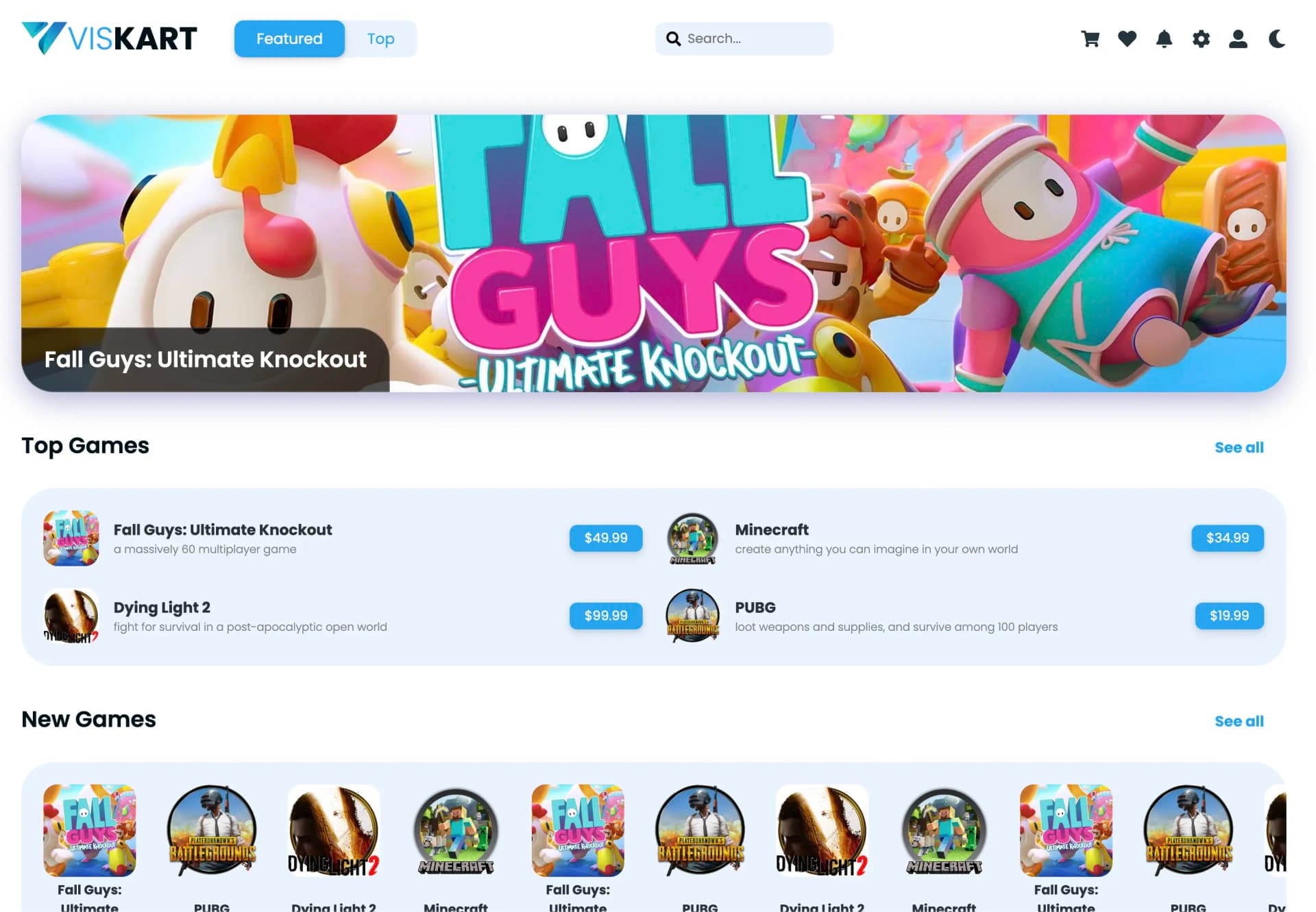
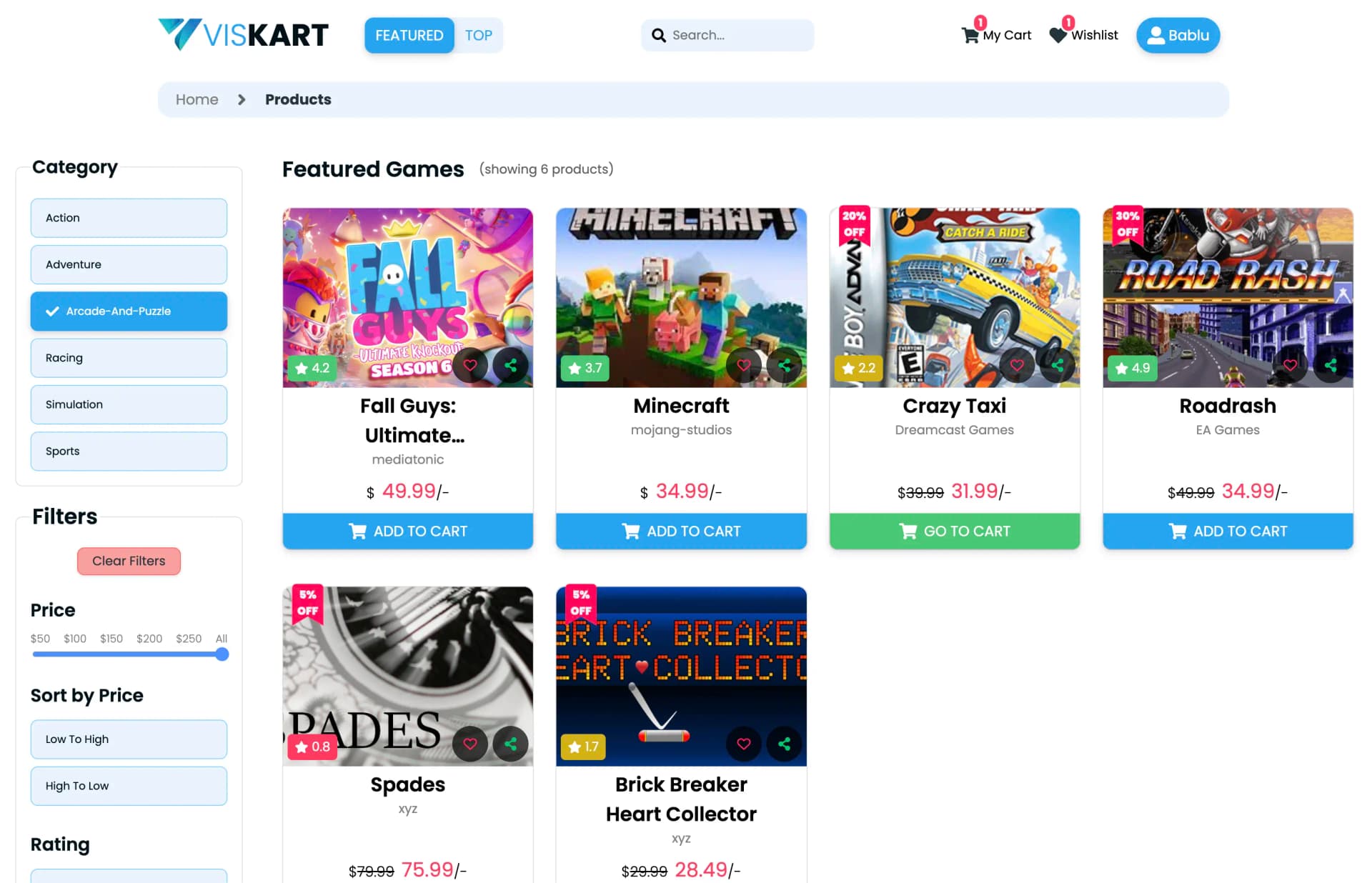
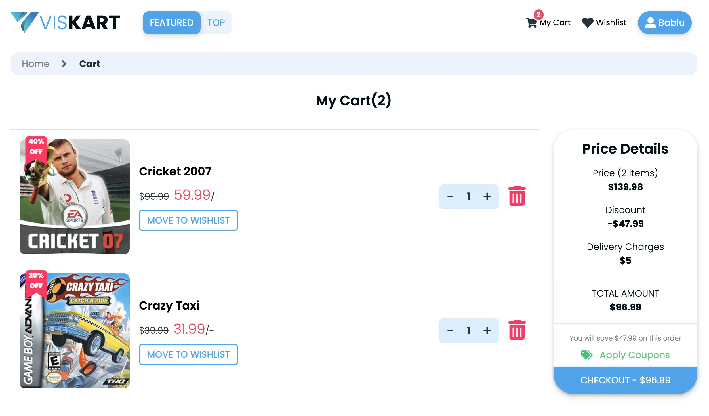
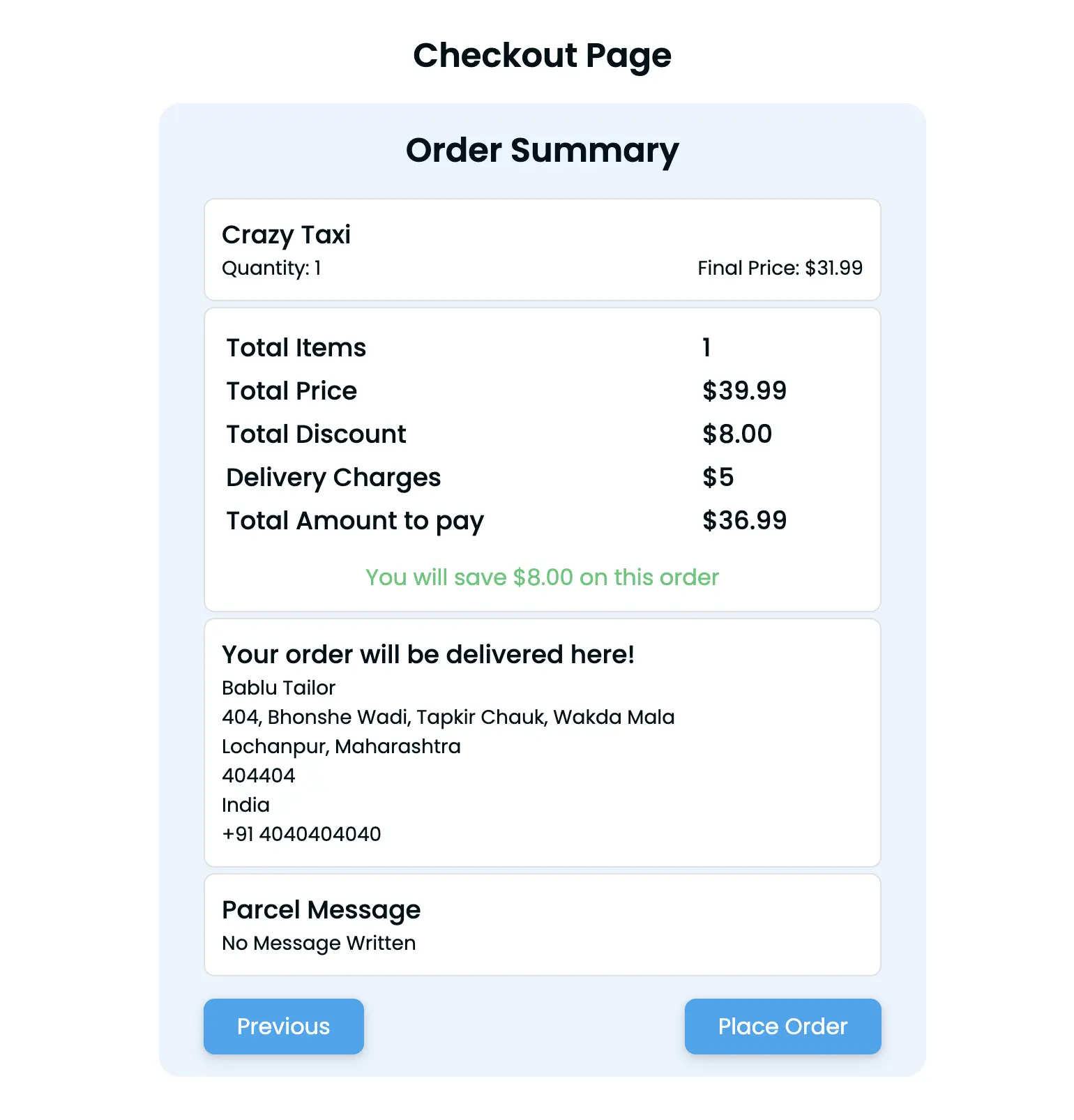
Why I built it
UI-heavy products have a failure curve I have watched more than once. They grow quickly because adding a screen is easy. Then they stop being editable because every screen was added slightly differently. Inconsistent component patterns and ad-hoc styling decisions pile up until a one-line visual change means understanding four files you have not opened in weeks.
Viskart's React version is a JavaScript-first frontend where I treated that curve
as the actual problem. The product goal was a visual product experience that is
clear, fast to navigate, and easy to extend. The engineering goal was that the
third adjective still holds after the twentieth feature. Open source, built solo,
grounded in the development branch of
VishalPatil18/viskart-react-version.
The bet
Spend structure effort up front on component boundaries and styling conventions, and buy back iteration speed later. That tradeoff only pays off if you enforce the boundaries once things get busy. Discipline, not cleverness.
Architecture
A React-first architecture with modular components and clear interaction paths, so the experience stays stable while I iterate quickly.
Views
Each view composes shared components rather than growing its own private variants.
Component layer
Own the state transitions and event handling, so the logic is testable away from markup.
No state assumptions, which is what makes them reusable across views without modification.
The boundary drawn early, before there was pressure to ship a screen quickly.
Foundations
Structured naming and layering, because visual regressions at scale are a consistency problem first.
A store would add a layer to reason about without solving the discipline problem it gets reached for.
Deliberately thin. Nothing here should need explaining to add a feature.
- View
- Component
- Foundation
- Tooling
A React-first structure where each layer has one job. Hover any block for the reasoning behind the boundary.
Componentized frontend
UI built as reusable, composable units with explicit boundaries, rather than screens that each grow their own private version of a button.
Predictable state flow
State transitions stay explicit. Implicit transitions are where UI bugs come from. Explicitness is what makes them debuggable when they show up anyway.
Organised CSS
Styling structured deliberately, because visual regressions at scale are a consistency problem before they are a CSS problem.
Iterative delivery
Small releases with quick feedback loops, which only stays safe if the foundations above hold.
- React
- React Router
- Context API
- JavaScript
- E-commerce
The tech stack
| Layer | Choice | Share of the repo |
|---|---|---|
| Application language | JavaScript | 82.5% |
| Styling and responsive layout | CSS | 16.9% |
| Build and system metadata | Misc config | 0.6% |
No state library, no CSS-in-JS runtime, no meta-framework. The absence is the point. At this size, React's own state primitives plus disciplined CSS organisation cover the requirement. Reaching for a library to solve a discipline problem tends to leave you with both problems.
Component boundaries as the primary defence
The decision that keeps this codebase editable is drawing reusability boundaries early, before there is pressure to ship a screen quickly.
That means separating interaction logic from presentation wherever the split is available. A presentational component that only renders what it is handed can be reasoned about alone and reused without dragging state assumptions along. Once that separation is the default, adding a feature is composition rather than archaeology.
What this costs
Up-front structure effort, every time, including on the features where it feels like overkill. The failure mode is not building the abstraction badly. It is skipping it once under deadline and then living with a second pattern forever.
Keeping state transitions honest
The loop
The only entry point into a transition - nothing changes state on its own.
A transition you can point at. Costs boilerplate, buys traceability.
Presentational components render what state hands them and decide nothing themselves.
When the render is wrong
Whether the bug survives the strip or vanishes, both outcomes narrow the search.
Follow the sequence into the render instead of guessing at the component that displayed it.
Usually where the defect actually lives, as opposed to where the symptom appeared.
Defensive changes sprayed across neighbours are how UI regressions get introduced.
Top row is the loop when it works. Bottom row is the mechanical path back to the transition that broke it.
A state transition should be something you can point at. An event handler changes state, state drives render, and render produces the next set of events. When each arrow in that loop is explicit, a wrong pixel on screen is traceable backwards to a specific transition.
That means more boilerplate in places. Some transitions could collapse into a clever derived value. I leave them written out. The clever version is the one I cannot debug at speed six weeks later.
Debugging UI bugs
UI bugs hide well. The symptom (something looks wrong) sits far from the cause (something transitioned when it should not have). I go mechanical rather than intuitive.
Reproduce with a minimal case
Strip the scenario down until the bug either survives or disappears. Either outcome is information.
Trace the state transitions
Follow the sequence of transitions leading into the bad render instead of guessing at the component that displayed it.
Isolate the render trigger
Identify precisely what caused the re-render. That is usually where the defect lives.
Fix narrowly
A targeted fix at the identified trigger, rather than a defensive change sprayed across nearby components.
Why narrow fixes matter more in UI code
Broad "just in case" fixes in a component tree are how you get regressions somewhere you were not looking. If the diagnosis was precise, the fix can afford to be small.
Styling that survives feature growth
CSS is 16.9% of this repo. That is enough to become a liability if it is unstructured. Organised styling is what prevents visual regressions as the surface grows. Polish depends on consistency, and consistency across a growing UI is a naming and structure problem, not a taste problem.
The tradeoff is stricter naming and structural discipline, applied uniformly. As with component boundaries, you pay continuously and the benefit shows up as an absence: changes that do not break unrelated screens.
Design rationale
How do you stop UI complexity exploding as features are added? Enforce reusable component boundaries early. Separate interaction logic from presentation wherever that split exists. Standardise styling conventions so adding a feature does not mean rethinking foundational patterns. New work should be composition against established patterns, not a fresh set of local decisions.
What's your approach to debugging UI bugs? Reproduce with a minimal case, trace the state transitions, isolate the rendering trigger. That sequence keeps fixes targeted, which is what prevents the broad regressions that come from patching symptoms near where they appeared.
Why keep state explicit when React makes implicit derivation easy? Explicit transitions are the thing I can trace during a bug. Implicit state is cheaper to write and more expensive to diagnose. In a UI-heavy product, diagnosis is the recurring cost, not authoring.
Why no state management library? The project is JavaScript-dominant and component-scoped by design. A store would add a layer to reason about without removing the discipline problem it is usually reached for. A library was never going to enforce consistency on my behalf.
What I took away from it
Structure is a bet on your future self
Every convention in this project (component boundaries, explicit transitions, organised CSS) costs a little now and pays out only as bugs that never happen. Unsatisfying on the day you pay it. Obviously correct three months later.