

Why I built it
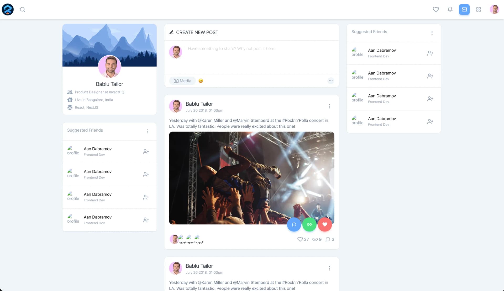
Users need relevant content quickly. Generic ordering (newest first, A to Z, whatever the database happened to return) consistently underperforms against something context-aware. REcom is my attempt to work on that gap in a form I could actually look at: a recommendation-oriented web app where relevance decisions show up on screen immediately rather than in a notebook cell.
For early-stage recommendation work, the deliverable that teaches you the most is a usable product surface. You can read about ranking strategies forever. You learn more from watching a list reorder and asking whether the new order is actually better.
Relevance first, then everything else.
Sole builder, spec-driven
No teammates, no reviewers, no assigned tickets. I worked against specs I wrote
myself, kept an append-only session knowledge base in claude/context.md, and
logged what each session taught me in claude/learnings.md. The discipline had
to come from the process, because it was not coming from a team.
Architecture
Presentation
Thin by design - roughly 0.6% of the codebase. The shell renders; the JavaScript decides.
Presentation only. Deliberately unexciting so the interesting complexity stays in the logic.
Logic (JavaScript, ~98% of the code)
Orders items by expected usefulness. Kept small on purpose so a change to ranking stays attributable.
Pushes ordering changes into the view. The seam that lets ranking change without the UI changing.
What the user sees
Reordering is evaluated by looking at it. That is why the deliverable is a web app and not a script.
- Presentation
- Logic
- Rendered output
Four layers, and one seam that matters: ranking decides, rendering displays. Hover any block for the reasoning.
Four layers, deliberately few. An app shell owns the page. A recommendation logic module produces the ordering. A data-binding layer pushes state changes into the view. A styling layer handles presentation. The seam between "decide the order" and "render the order" is the whole point. Clean that seam and ranking can change without the UI changing.
- React
- Redux
- Tailwind CSS
- JavaScript
- CSS
The tech stack, and why
| Layer | Choice | Why it earned its place |
|---|---|---|
| Core language | JavaScript, ~98% of the codebase | Logic and app code in one language, no build-step ceremony between an idea and seeing it run |
| Styling | CSS, ~1.4% | Presentation only; the interesting complexity is in the logic, not the theme |
| Markup | HTML, ~0.6% | Page structure, thin by design. The shell renders, the JS decides |
That 98/1.4/0.6 split is not neglect. It is what a project looks like when the questions you are asking are all about behaviour.
Relevance ranking
Ranking items by expected usefulness to the user is the feature. Everything else in the app exists to display it and to let me change it.
Complexity grows with personalization depth. A simple global ordering is trivial to reason about and trivial to debug. The moment ranking depends on per-user signals, every bug report becomes "for whom, in what state," and you need logging before you need cleverness. I kept the ranking surface small on purpose so that when I changed it, I could still tell what changed.
The iteration loop
With no teammate to push back, the written spec is the only thing that can disagree with me.
A single ranking or interaction change per pass, so the effect on the surface is attributable.
Perceived relevance is judged in the laid-out interface, not in a scored list.
What persists between sessions
Session knowledge base. Nothing is rewritten, so the history of decisions stays readable.
The generalizable lesson from each session, written for future me.
No reviewer, so the spec and the journal do that job. The loop closes by looking at the UI, not by reading a diff.
Write the spec first
Before touching code I wrote down what the change was supposed to do. With no reviewer, the spec is the only thing that can disagree with me.
Change the logic
One ranking or interaction change at a time, so the effect is attributable.
Look at the UI
The whole reason the project is a web app. Reordering is something you evaluate by looking at it, not by reading a diff.
Append to the knowledge base
claude/context.mdgrows append-only;claude/learnings.mdcaptures the generalizable lesson. Future me is the reader.
The tradeoff I signed up for
Optimizing for iteration speed risks technical debt if the patterns never stabilize. Shipping fast and stabilizing later is a real cost, not a free lunch. On a solo project nobody stops you from paying it forever. Naming it here is part of how I keep it in view.
Design rationale
How do you evaluate recommendation quality in an early-stage product? Start with proxy metrics and qualitative UX checks, not offline benchmarks you cannot yet interpret. Early on, iteration speed plus clear logging tells you which changes improved perceived relevance. Rigorous behaviour metrics are something you graduate into once there is enough usage for them to mean anything. Reaching for NDCG on day one is a way of feeling scientific without learning anything.
Why build the UI before settling the algorithm? Recommendation quality is a perception problem as much as a math one. A ranking that looks right in a scored list can feel arbitrary in a laid-out interface, and you only find that out by rendering it. The product surface is the measuring instrument.
Why keep the stack this thin? Every framework I did not add is a layer I did not have to debug when the ordering looked wrong. For a project whose purpose is to iterate on logic, plain JavaScript over an HTML shell keeps the distance between a change and its visible effect as short as it goes.
Where it stands
Still in iteration
REcom is live and open source, tracked on the development branch. It is an
earlier project and I would rather describe it accurately than dress it up. The
ranking strategy is still being tuned. The parts I would point at as finished
are the surface and the iteration process around it, not a settled algorithm.